Breeze Airways commenced flights for the first time this week after months of anticipation. We previously covered the reason why the start-up changed its name ahead of its launch. Now, following a talk with Gianfranco “Panda” Beting, who worked with the airline on its branding, we thought we’d share details on what the carrier’s livery represents.

The perfect team
Beting is no stranger to ambitious livery projects alongside Breeze founder David Neeleman. The pair worked together on TAP Air Portugal’s branding and customer experience. Beting designed the airline’s innovative retrojets. This program wasn't only about an aircraft sporting retro livery. The designers decided to throw retro experiences. So, from flight attendant uniforms to the food served, to the movies shown, everything went back to the early 1970s.
So, with a record of providing a wider story with the livery. Beting decided to think outside the box. Altogether, Neeleman and his colleagues wanted to create a brand that “made life easier” for its passengers. They were keen to provide a truly “nice” experience for those hitting the air.

Minor tweaks can go a long way
Time was running out following a series of brand changes. The company had to submit information to manufacturers, and the deadlines were edging closer. Nonetheless, Beting and his team managed to make it just in time.
“I had a small group of people helping me out with the final details with the technical drawings to be applied to the Airbus A220s, and we delivered everything by December 29th, 2019. Then, on January 4th, one member of the group called me said, 'Panda, there was a change of heart - David doesn't want that brand, logo, and livery on the airplane anymore.' I had to control my feelings of frustration because everything was finalized, the drawings were with Airbus, we had a brand, and then overnight we didn't have one anymore,” Beting told Simple Flying.
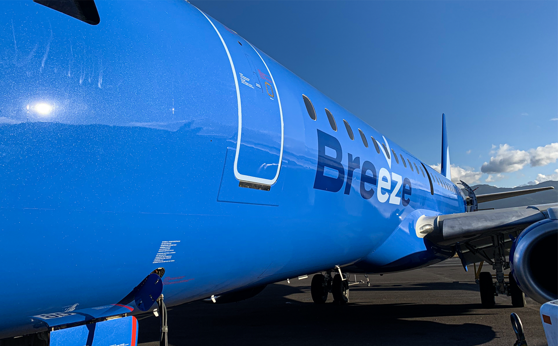
“So, within a very short period of time, I would say probably five days, I came up with the image that conveys easiness, which is to highlight the EZ on the Breeze spread because, at the very heart, we want the experience to be easy. So, I highlighted the easy, and then I created the figure, which is a checkmark, which symbolizes a flight. It also symbolizes an ascending bird, if you will, for an ascending airplane, and that checkmark is called the ascent in the Breeze group.”
Stay informed: Sign up for our daily and weekly aviation news digests.
Meeting requirements
Overall, Breeze was impressed with the new touches and said that Beting had created something better. Therefore, the new design was given the green light.
The livery was always going to be blue because this color is a trademark of Neeleman. It’s been billed as his lucky color, being used on the livery of the likes of Azul and JetBlue over the years. So, the serial entrepreneur told Beting, “you can choose any color provided that the best color is blue.”

Beting insisted on going metallic, but Breeze refused as this route would have been too expensive. Thus, the team compromised and decided to add mica to the basic colors. Standing close to the aircraft, viewers will notice a sheen with the livery due to this factor. The paint is not a solid blue as the mica gives a unique look and feel to be more sophisticated.
Another last-minute change was to do with the ascent mark. Beting recommended having the mark in different colors on each plane. However, the final call was to have them all in blue. Altogether, everything was all approved in the middle of January 2020, ready for Breeze's reveal.
What are your thoughts about Breeze Airways' branding? Are you looking to fly with the airline this year? Let us know what you think in the comment section.