Croatia Airlines has responded to the new Brussels Airlines livery, which is remarkably similar to that of Croatia Airlines. The Croatian flag carrier said it was proud if its livery was an inspiration.
Croatia Airlines responds
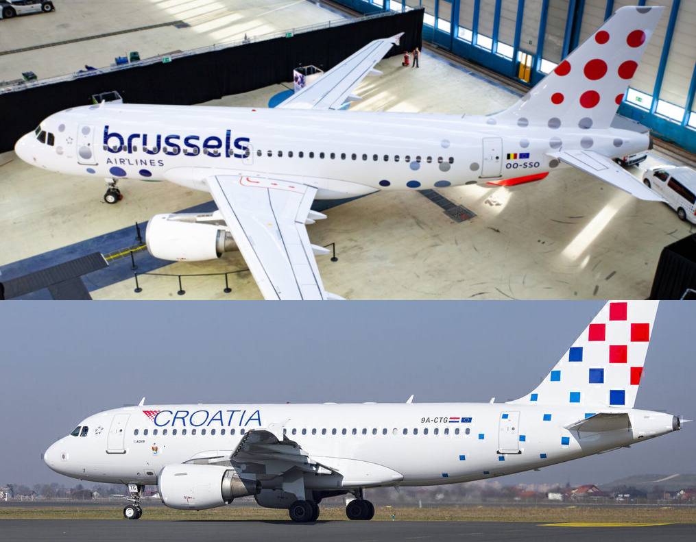
When Brussels Airlines unveiled its new brand identity last month, its livery prompted many in the aviation community to notice its striking resemblance to the livery of Croatia Airlines.
Croatia Airlines has now responded to its fellow Star Alliance airline's new livery by saying the following, as reported by Ex-Yu Aviation News:
"The design of our visual identity is recognizable both in Croatia and abroad, and we are proud if it served as an inspiration to other carriers with their own designs."
Furthermore, commenting specifically on tail livery, Croatia Airlines said:
"It should be noted that in 2005 the company was the recipient of the international ReBrandTM award for our livery as judged by some of the world’s most respected experts in the field of design."

Stay informed: Sign up for our daily and weekly aviation news digests.
It is a new livery for Croatia Airlines too
The livery of Croatia Airlines that is so similar to the new livery of Brussels Airlines is also relatively new.
Croatia Airlines applied it to its fleet between 2019 and 2020 to visually refresh the existing livery, which had fewer squares on the tail and which had the entire aircraft belly painted in blue. The pre-2019 livery is pictured below.
The other difference is that the word "Croatia" is now larger than it was in the old livery.

Brussels Airlines unveiled its new identity in November
In November, Brussels Airlines presented its new logo, livery, and colour scheme to reaffirm its identity as the flag carrier of Belgium.
The lowercase ‘b’ on the tail of the aircraft is gone, and it has been replaced by dots. The tail now features different sizes of bubbles in a deeper red, blue, and gray scheme, with more of these across the fuselage.
The airline’s new logo now features nine red dots of varying sizes, and the purpose of this is to represent diversity at the airline.


What do you think of the similarities between the livery of Croatia Airlines and the new brand identity of Brussels Airlines? Let us know what you think of Croatia Airlines' reaction in the comments below.