With operations based in Denmark, Sweden, and Norway, SAS (Scandinavian Airlines) has had a rich history of connecting Scandinavia with the rest of the world since the late 1940s. Formed as a consortium of three different Scandinavian air operators, this group would be named Scandinavian Airlines System, which is most commonly abbreviated to SAS. With over 75 years of history, let's look at how the airline has dressed up its aircraft.
The 1940s: Bare metal
The look of SAS' first airplanes was very much in line with other early air operators: A mostly unpainted, bare-metal fuselage with accents and markings across the body. Along with the airline wordmark across the fuselage and "Scandinavian" on the tail, each aircraft had its own Viking name.
Aircraft were adorned with a dark blue "cheatline" across the fuselage. Unique to the airline was that the front of this cheatline had what Scandinavian Traveler calls a "dragon-headed Viking longship motif."
.jpeg?q=50&fit=crop&w=1500&dpr=1.5)

The 1940s to 1980s: A white top with metal belly
When paint technology evolved, airlines (including SAS) adopted their liveries as well. This would see the airline's aircraft take a mostly white fuselage with the word "Scandinavian" boldly displayed across the side. On the tail, the word Scandinavian was replaced by SAS.
The blue cheatline with Viking longship motif was carried over, painted against the white base. However, this was positioned above bare metal engines and a shiny, bare metal belly.
This look was used up until the early 80s- although in 2006, in honor of the SAS Group's 60th anniversary, the carrier painted an Airbus A319 in this retro livery.

The 1980s to late 1990s: A splash of color
Scandinavian Traveler notes that the "Scandinavian Belly Stripes" livery was created in 1983 and represents the Danish, Norwegian and Swedish flags. This look saw the removal of the cheatline while maintaining the word "Scandinavian" across the side of the fuselage and SAS on the tail. Meanwhile, the body of the aircraft was made completely white.
Apparently, the incoming CEO at the time, Jan Carlzon, was particularly opposed to the Viking markings. He had doubts that many members of the public would understand the dragon head reference while fearing that others associated Vikings with pillage and rape.
Replacing the Viking markings was a splash of color in the form of the belly stripes was placed in the forward-third of the fuselage, between the nose and engines. As for engines, they were painted white and marked with 'SAS.'

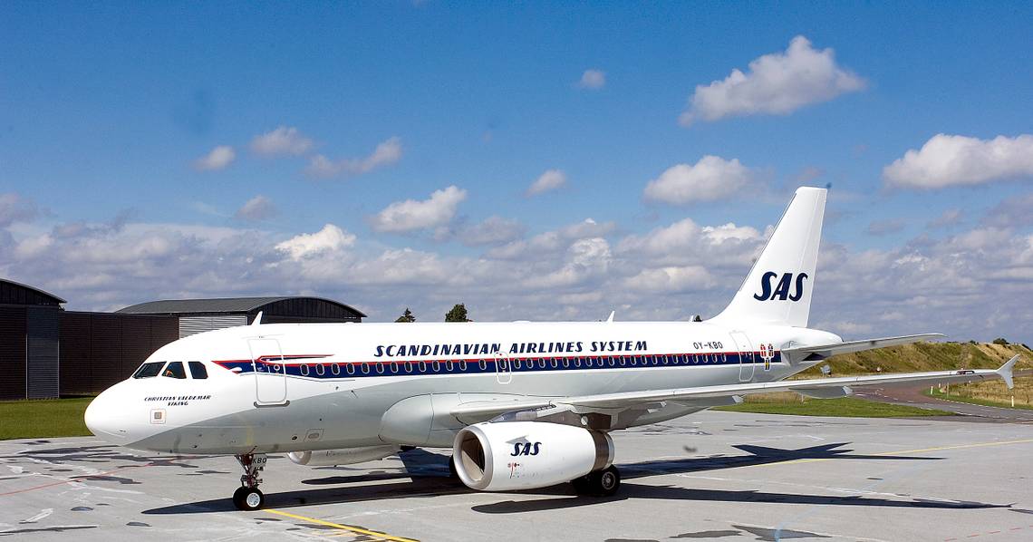
1998 to 2019: Red engines
The belly stripes were the core of the SAS livery until 1998. At this time, the airline unveiled a new corporate identity, along with a new livery and an updated logo.
Stay informed: Sign up for our daily and weekly aviation news digests.
This livery had the words "Scandinavian Airlines" painted on the forward fuselage. This was applied in a light silver paint, making it appear better at certain angles of lighting. "Scandinavian" appeared above the window line while "Airlines" was placed below. The livery also featured bold red engines and a blue tail.

2019 to today
Changing its livery for the first time in 21 years, SAS launched a brand new visual identity in 2019. The airline called the new look "a modern take on classic Scandinavian design."
The significant changes to this livery from the previous were as follows:
- The blue color of the tail was extended down to the fuselage.
- The silver "Scandinavian Airlines" at the front was replaced by the airline's SAS logo. This logo would retain the same light silver as the previous livery.
- The red engines would be replaced with a light silver paint with a thick blue stripe at the leading edge.

"The new livery design is a symbol of our future, a more sustainable and competitive future for SAS, but one that also embraces our heritage. Travelers from Scandinavia will recognize their home, while global travelers will encounter the renowned feeling of the Nordics,"
-Rickard Gustafson, President and CEO at SAS
WIth five liveries under its belt, it's fascinating to see how the carrier has evolved. An understated simplicity has usually been at the center of its identity, with the "red engine" look being one slight diversion.
We'd love to know which livery is your favorite. Leave a comment and let us know!