Update: One Mile At A Time has noted that the below livery is NOT United's new livery after a spokesperson reached out to them.
As the world waits for the big reveal of United Airlines’ new livery and branding, their designer seems to feel the time is right to unveil it now. Simple Flying have uncovered a great big leak in the system and are sharing the potential designs for United Airlines new livery right here with you today.

United Airlines were due to unveil their new livery at some point this month. Oscar Munoz confirmed that an update was in the pipeline and said it would be ‘April-ish’ when the big reveal was due to take place.
However, a San Francisco design firm who like to keep their customers updated on their current projects might just have leaked a sneak peek at the new United livery.
While there are a total of four concepts currently out for public viewing on the designer’s site, all four are pretty much of a muchness. We can’t be certain that any one of these will be the final United Airlines branding, but it seems highly likely that this could be the case.
The designer is a legitimate agency, having worked with companies such as Cesar’s Entertainment, Visa and Houzz in the past. We’re excited to share this leak with you, although we’re not sure the designer will be so pleased (tee hee).
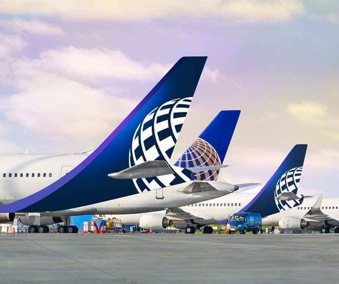
United Airlines leaked livery
David Scott Design Office, based in San Francisco, has uploaded a bunch of concepts to their website today which appear to be the mock-ups for United’s new livery. The caption on their website reads:
“Design the most iconic piece of branding in aviation—the livery. Refine the historic globe of Continental Airlines giving it new life as a modern brand element for United Airlines. The old becomes new again for the combined airline.”
There are actually four different concepts on the website. Largely, they are all very similar, with the main difference being whether the purple line is straight, curved or otherwise. Here they are:
Design 1


Design 2


Design 3


Design 4


An evolution
When the rebranding was announced, Munoz said that it would be more of an evolution than a revolution. As we can see from the concepts, it’s very much in keeping with this idea.
Gone is the gold cheatline, wiping the slate clean of any hint of Continental Airlines from 2010. New to the livery is the addition of that gorgeous purple colour, which we think is probably either Atlantic Amethyst or Premium Purple. We’ve already seen this hue in both their new uniforms and their Premium Plus seats, but it’s a real treat to see how it’s potentially going to look on their aircraft.
As with the new uniforms, their main colour, named Rhapsody Blue, features heavily in all the designs on the table. As we predicted, the ‘United’ name uses a new font and is much larger on the new livery, reaching down to below the windows.
United kind of revealed this already, as their template for the ‘Her Art Here’ competition suggested this would be the case.
What do you think of the new livery? Let us know in the comments!